Back in early summer, I met with my most challenging client yet.
The brief?
To create a fresh, unique brand identity for our local primary school.
Och, that’s easy! You might think. But no…
There’s a lot of people vested in our school community of Nether Currie Primary. Firstly, there’s the 168 kids who go there. To learn, play, fight and laugh. Then there’s their parents or carers (some of whom do pretty much the same thing, hehe!) And let’s not forget the teachers and school staff. Legends, all of them.
So, as a project, this was pretty unique – this whole school community was effectively the ‘client’, as well as the target audience at the same time. And, as a parent of two boys who go to the school, that also included me!
The first thing to do was to find out what was important to the kids about their experience of school. The head has done a great job of instilling core values throughout, and it was inspiring to hear what mattered to the kids when we addressed them at Assembly.
We’re lucky to have a school that sits with plenty of green space. There’s a mini forest right on our doorstep, the Water of Leith is in our catchment and in no time at all, you can be rambling in the Pentlands. All on a 44 bus route right into the heart of our fabulous capital for those day trips.
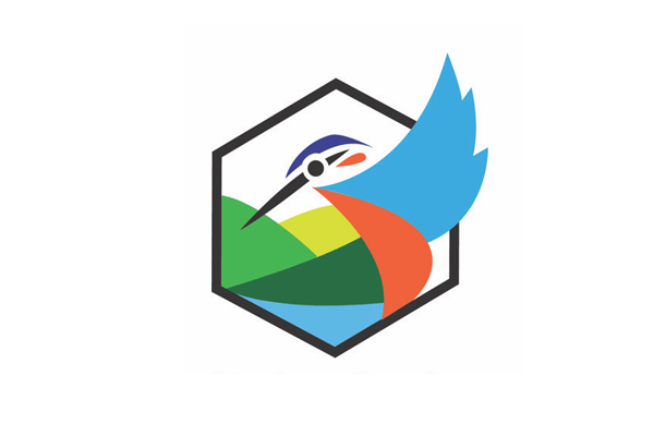
Me and two other keen parents teamed up to form a committee. I drafted a design brief, as we would for any client, and gave it to the kids to consider. I recruited 168 mini designers to work with us to collaborate on a new look for our school. This was great fun and inspiring – we had all sorts of concepts submitted! From squirrels to stars; wolves to mill wheels; kingfishers, acorns, owls, diamonds, books, beetles and hills. There was even an inexplicable, but expertly executed, pizza slice, complete with pepperoni!
The overwhelming theme of nature came through – not surprising, given our location.
We whittled down the kids’ ideas and my job was to develop the concepts into workable visuals. We then asked the wider community to provide feedback. It was massively positive and vindicated our decision to go down the nature route, and in particular, choose something that was a little less obvious but still represented the uniqueness of our school.
The emblem? An agile, nimble, fast, adaptable, clever little kingfisher, who punches waaaay above her weight. Perfect for our wee school with a big heart and ambitious ideas.
The uniform was introduced this term, to much acclaim. Now the playground is awash with kids running about in a cheerful royal blue, with a complementing shade for the P7s (because they’re the Big Ones).
And the best bit? The kids are really proud to wear it.
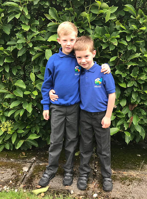
Nether Currie Primary School’s new uniform, as modelled by Archie (8) and Fergus (5).
If you are looking for a design agency in Edinburgh that will match your vision, contact us now at 39 Steps.