Adaptation Scotland
responsive web design
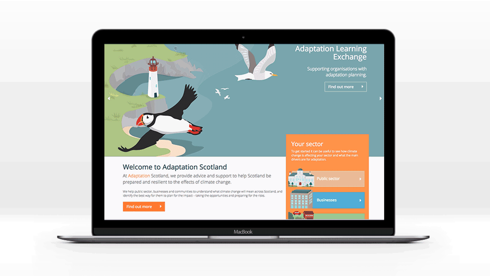
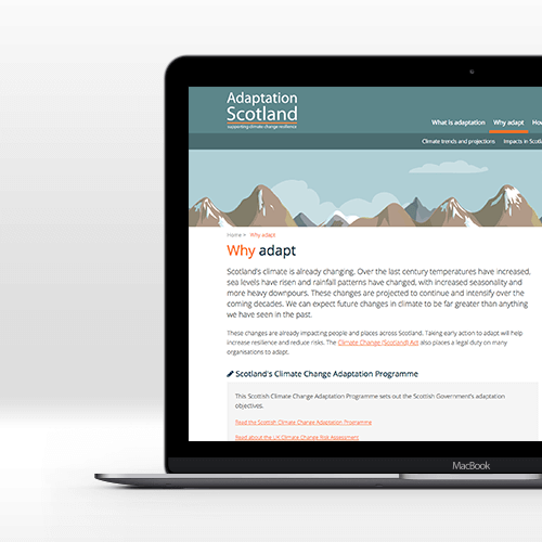
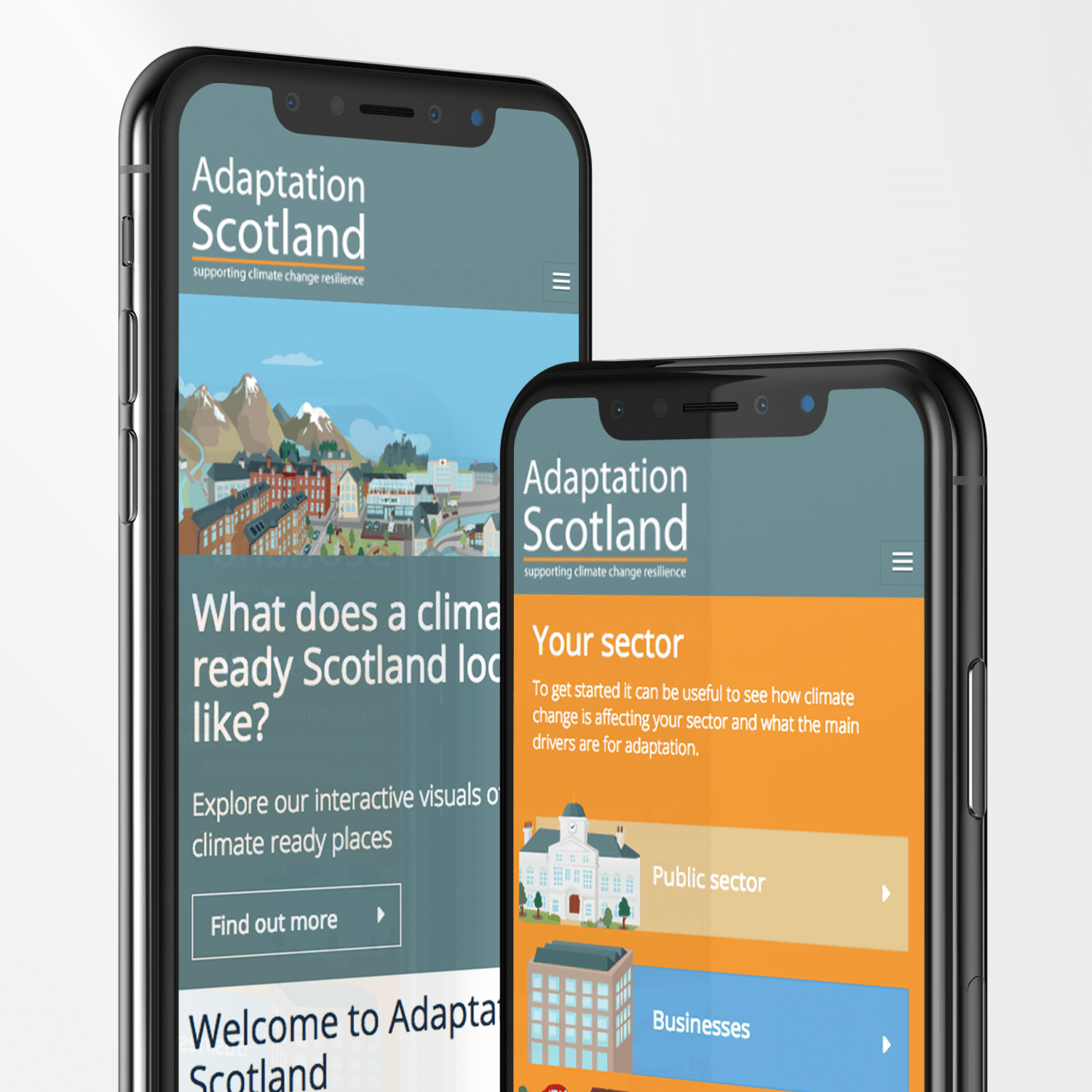
Adaptation Scotland approached us to revamp their website, making it work well for mobile and tablet users, as well as desktop computers. It’s a content-heavy, resource-driven site, which needed to be easy for all user’s to navigate and find content. The resulting responsive web design was clean and visually interesting but most importantly, made it easy to find content.

user journeys
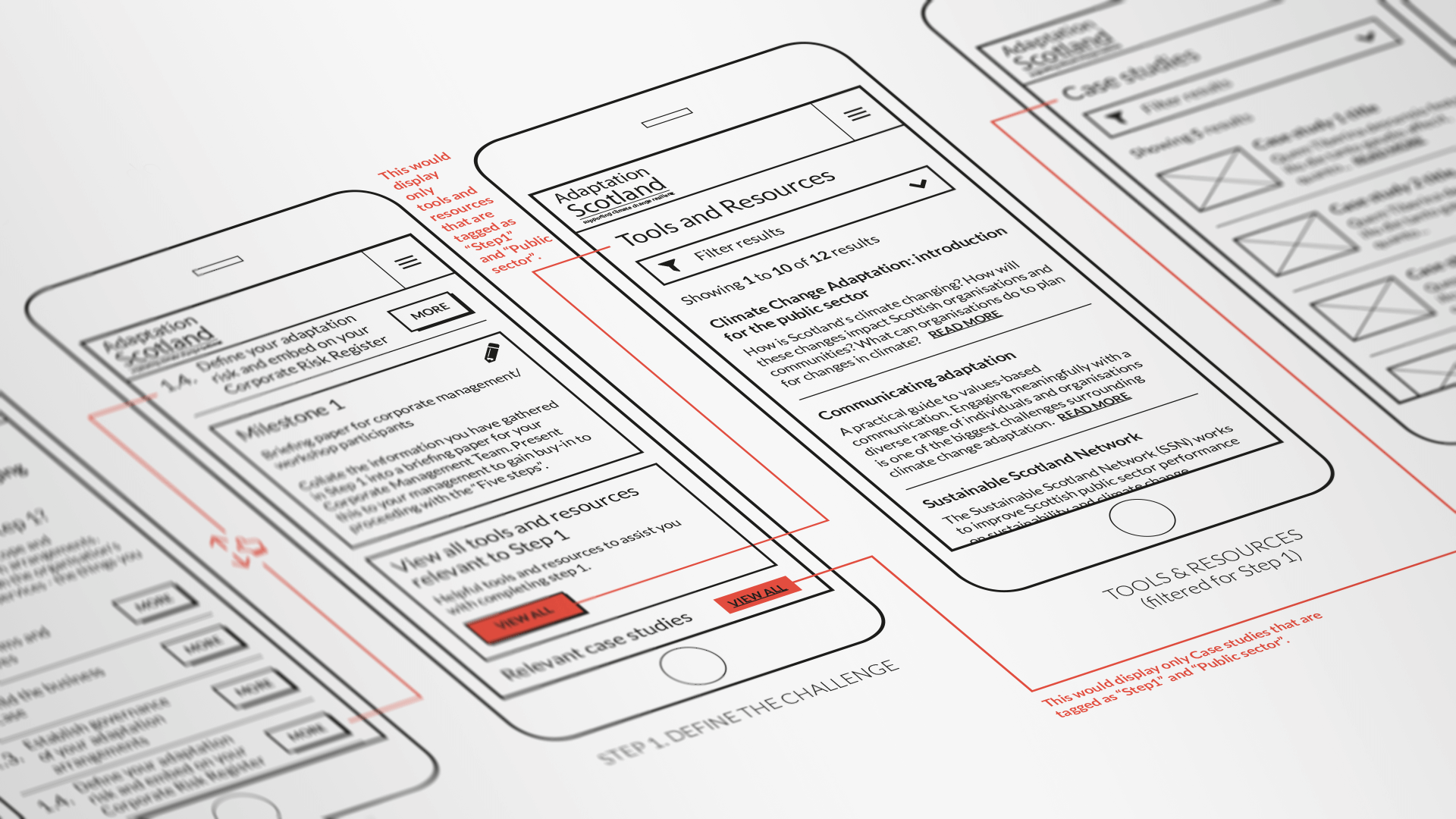
With UX design being such an important part of this responsive web design project, we developed extensive user journey’s based on the outcomes of our user persona’s workshop. The user journey’s allowed us to rapidly prototype key areas of the website, making iterative changes, through user testing, resulting in a very user-friendly navigation at launch. For resource-rich websites, UX design is critical, users often simply give-up on using websites when they can’t find what they are looking for quickly.
our folio
view all[/et_pb_text_extender]

take the next step
Let’s discuss YOUR project and see which bundle suits you best.