I didn’t expect to be thinking about a responsive web design analogy when I went to the theatre. It was supposed to be a relaxing break from work!
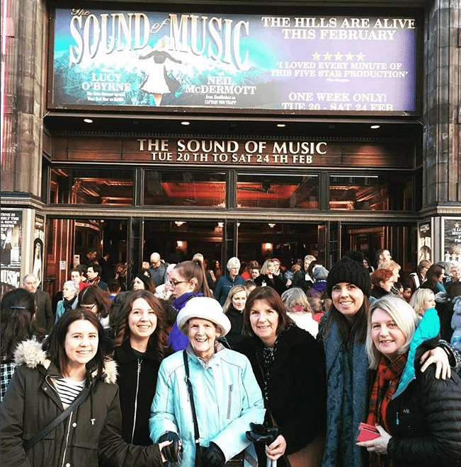
For Christmas, my sisters and I got tickets for our Mum, Auntie and Great Auntie to ‘The Sound of Music’. It has been a family favourite for years, so we were all really excited. Luckily, their website made it easy for me to select a seat for my 89-year-old Great Aunt, that meant she only had to go down a few steps, which was really handy!
The show was brilliant and all the actors certainly did the original characters justice, we were signing along (…badly!) the whole way through!
I was particularly impressed by the set design. Adapting a film to stage comes with obvious restrictions – how to accurately translate the look and feel of the film, fit it onto the limited stage area and make it easy to switch sets between the acts. Quite a challenge!
In this case, the set design focused on three main locations – the abbey, and the interior and exterior of the Von Trappe family mansion. Moveable pillars were a consistent element, and were adapted for each set with interchangeable backdrops. It was a really clever and simple way to represent the locations in an easily transformable format.
With these pillars, I saw a responsive web design analogy – designing for multiple screen resolutions – with responsive content that adapts to any device. On mobile displays, some content is not necessary – but as long as you have consistent elements (your pillars) the experience for the user should appear seamless, as it was in the Sound of Music!