Heriot-Watt Student Union
“Choosing to work with 39steps and Indigo Leap is possibly the best decision we have made all year.”
Jamie Nutter / Depute CEO
brief
Heriot-Watt University is a global university with campuses in Edinburgh, Galashiels, Orkney, Dubai and Malaysia. Their Student Union needed a new brand to convey the wide range of services they offer and to encourage students to get involved with Union activities.
In collaboration with research agency Indigo Leap, we conducted a brand workshop with students, staff and alumni, to work out what was wrong with their current brand, and what was needed from a new brand.
We broke their target audience down to 5 key personas to fully understand their very different needs: from Gen Z through to post grads.
Through this process, we distilled the essence of what Heriot-Watt Student Union is all about. Which was:
Students first. Always.
brand
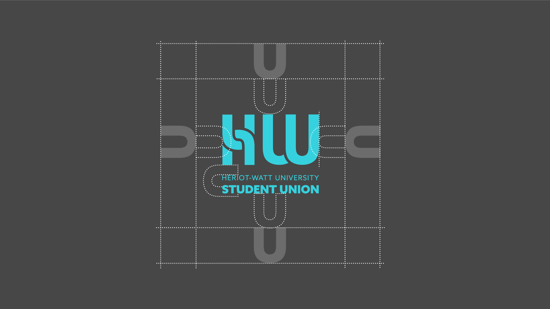
Using the theme of ‘Students first’ as a starting point we designed a neat brand identity. Our starting point was the brand essence which evolved into a strapline of:
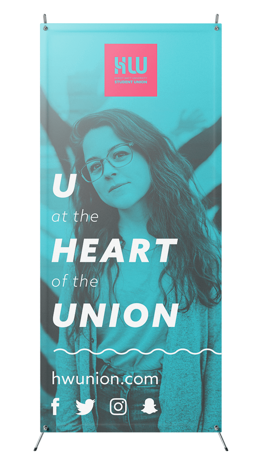
U at the heart of the Union.
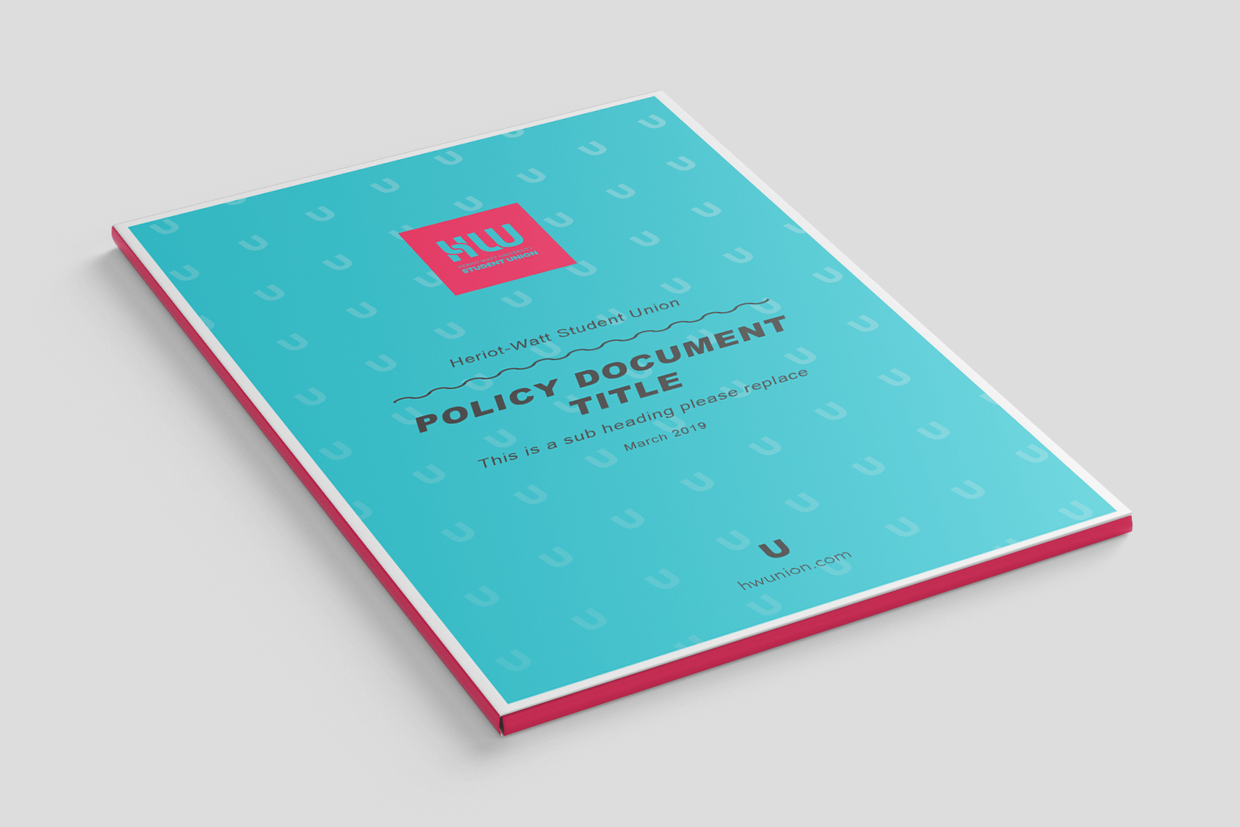
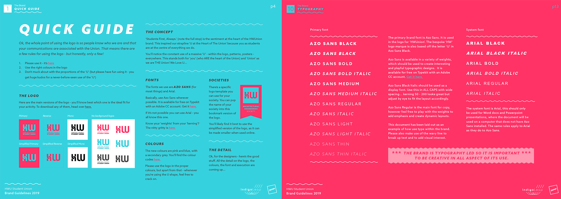
We devised a clever U motif that evolved into the main typeface of the logo ‘HW’. This literally represents how the Union puts students at the centre of everything they do. The result is credible enough to sit alongside the established university branding and playful enough to sit with partnered leisure branding (such as Red Bull).
Their in-house team need to be readily create a whole suite of graphics easily, so we created a cute ‘U’ motif they can to create engaging designs that are very recognisable as part of the Union brand.
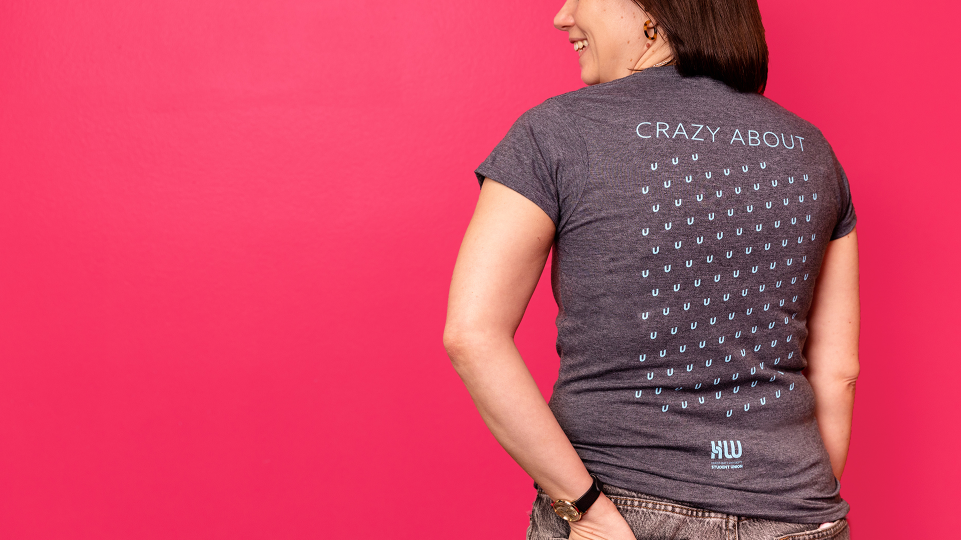
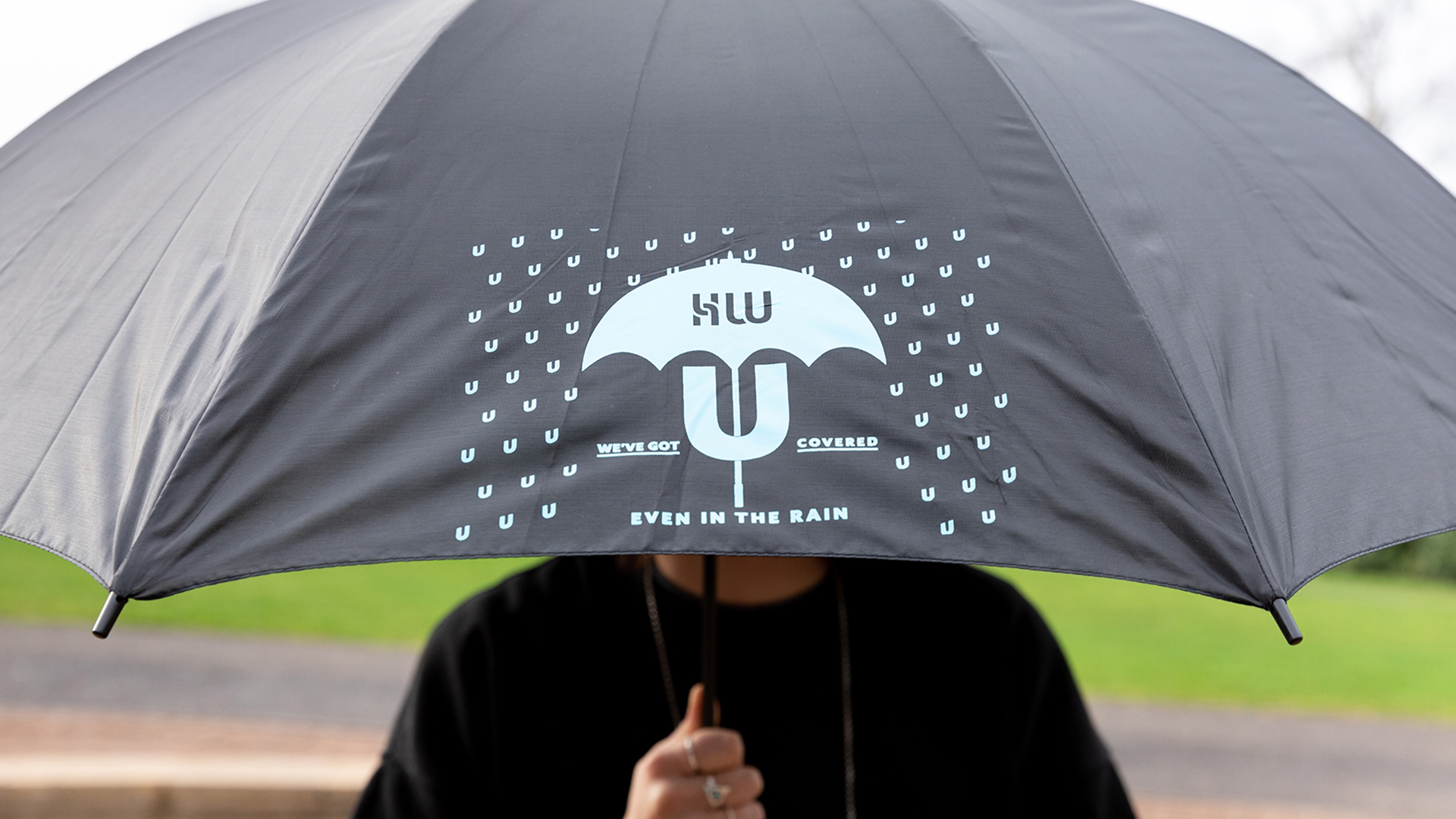
The ‘U’ from the typeface can be used as a fun and playful standalone motif, and, along with the strapline, communicates the essence of their brand to the students, staff and the world.
#ff3366
#36d1de
#474747
Colours
A bright colour palette helps the new brand stand out in the academic setting. The pink can be used to catch students attention, whereas the grey can be utilised for more corporate collateral.
Brand Guidelines
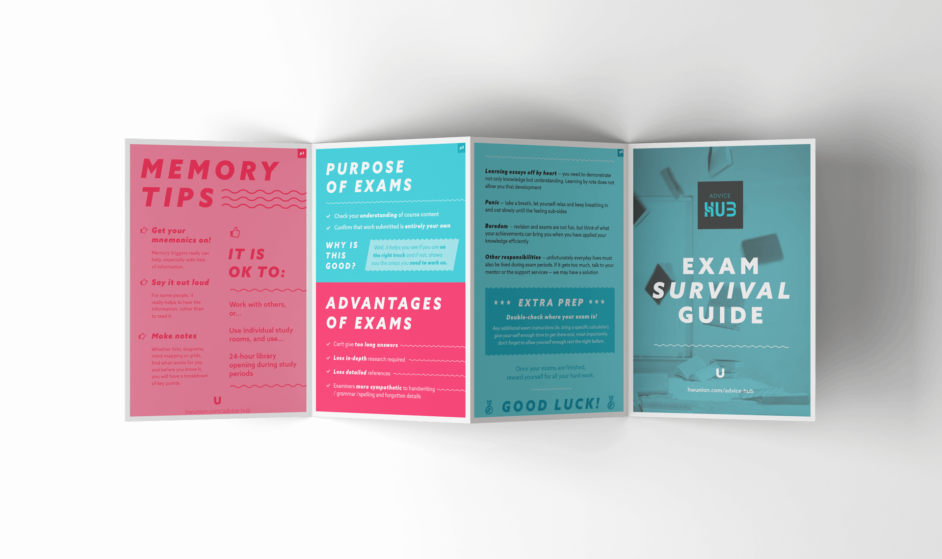
The in-house team were keen to have a flexible and versatile brand that could be embraced by students to create their own artwork and posters for events, further strengthening engagement with the brand. We created a handy ‘quick guide’ in the brand guidelines to avoid overwhelming students who simply want to make a poster or graphic. We also created a comprehensive version for the team to use which also covered tone of voice, sub-brands, image treatment and marketing guidance.
social media
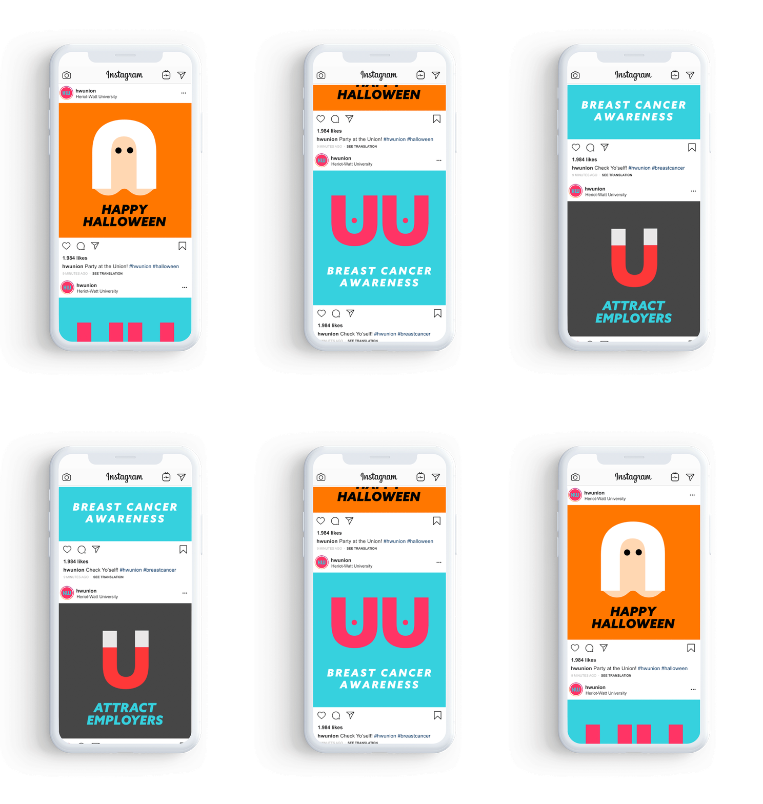
As the majority of their target audience are Gen Z there was a clear focus on digital media marketing as a platform for delivering their message. We made a series of social posts using the the ‘U’ motif in a playful way to encourage engagement with the students.
Merch
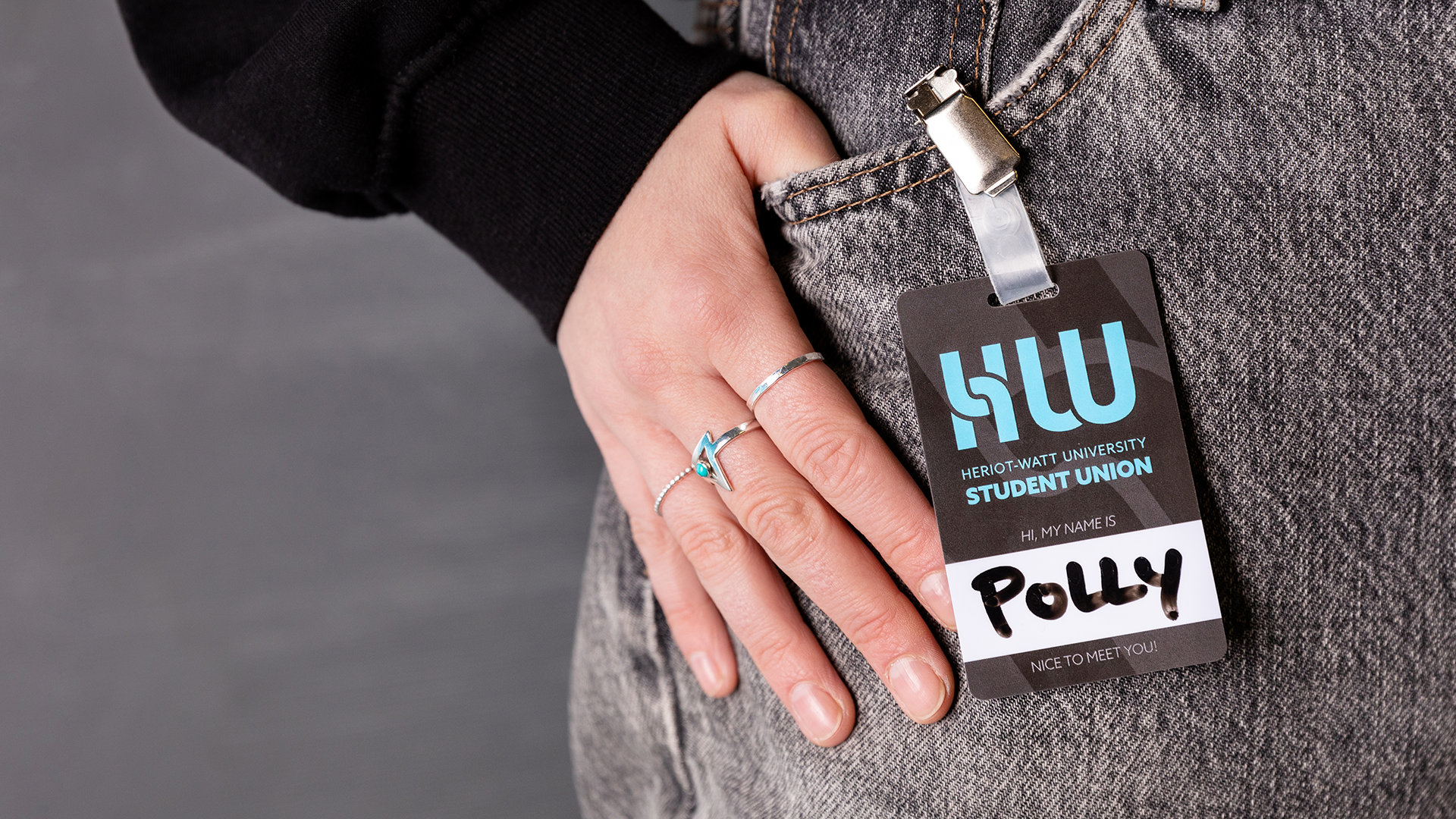
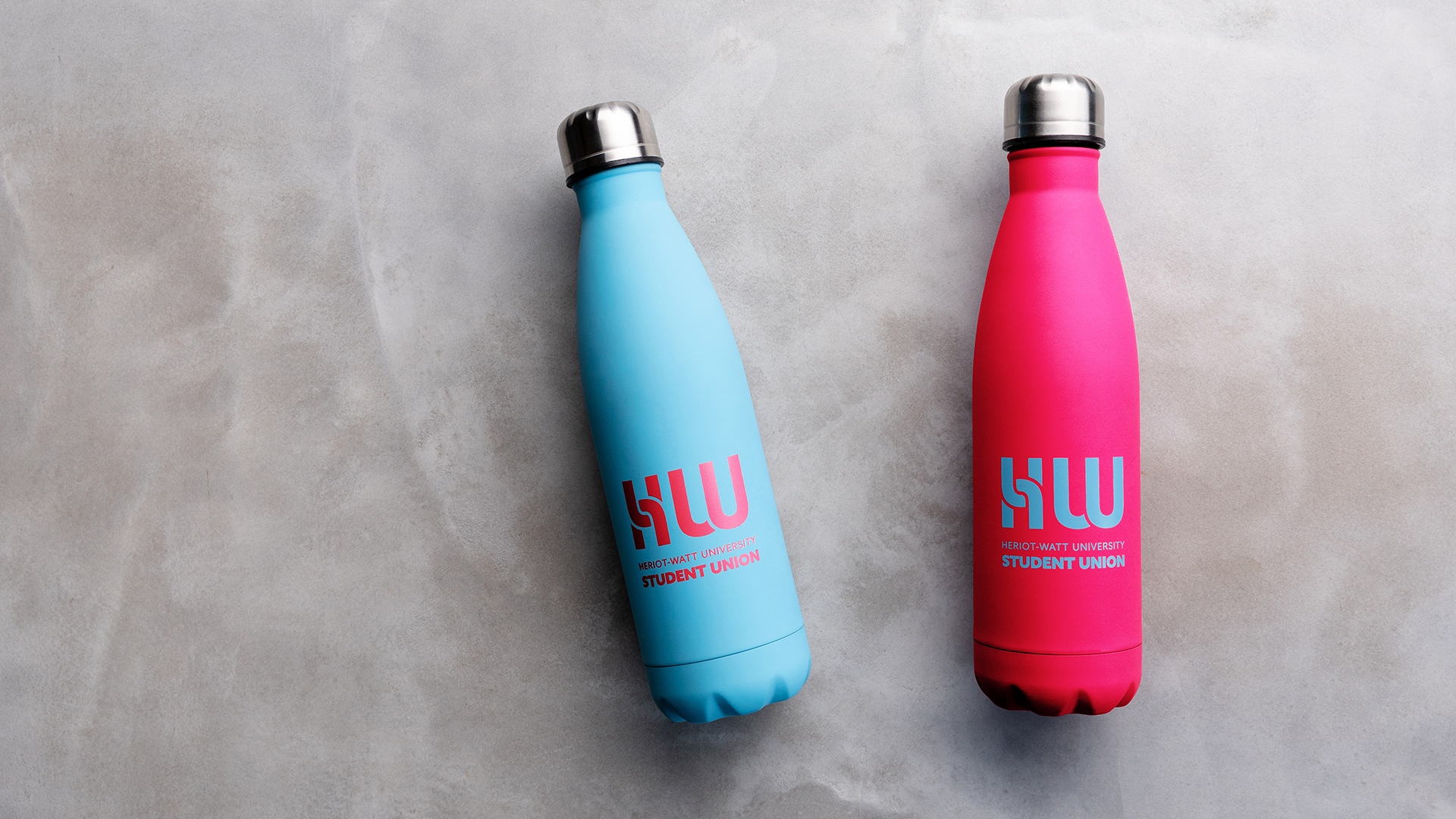
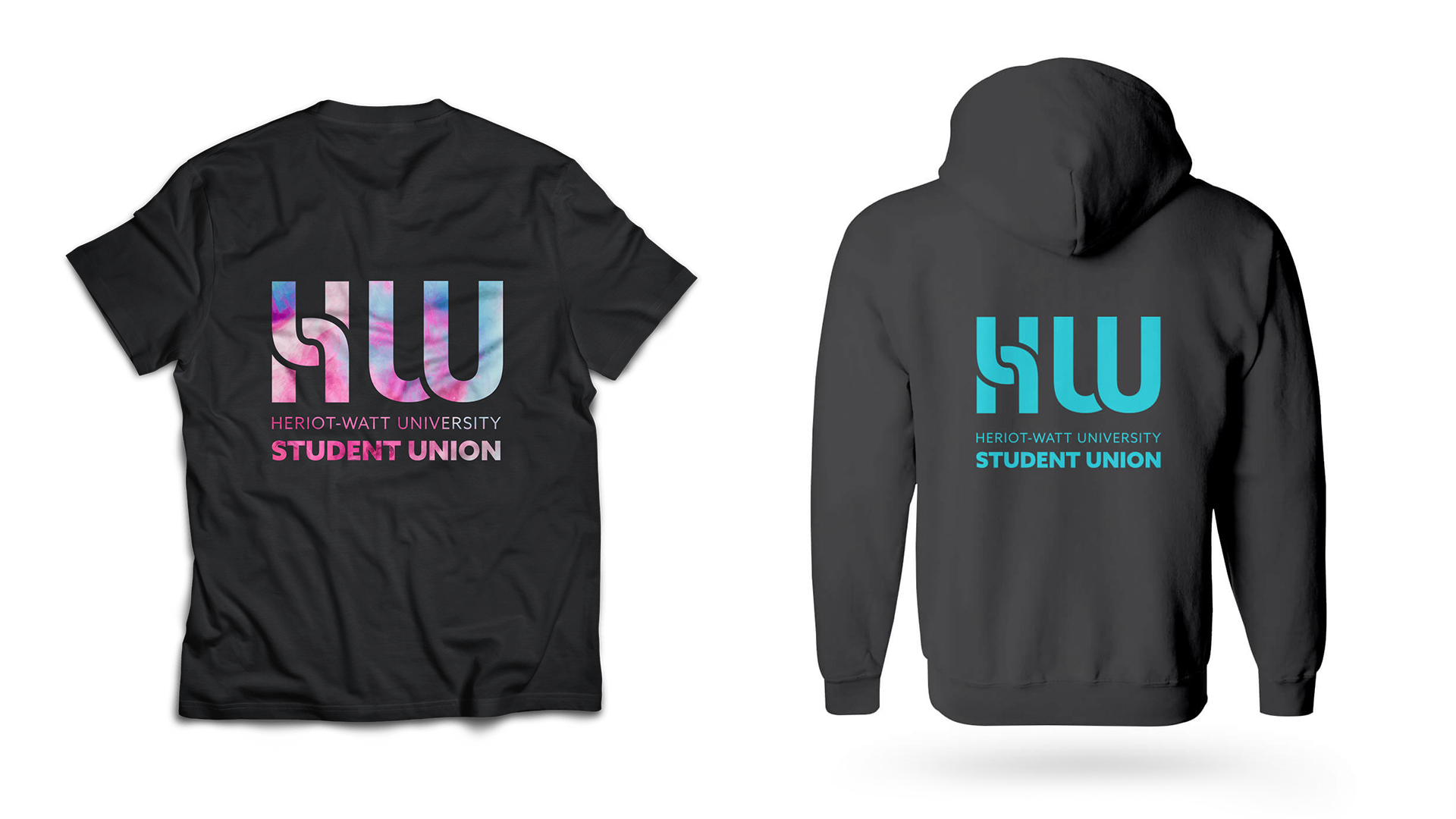
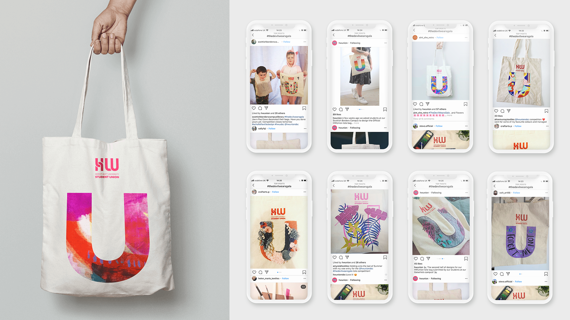
The new brand identity features across a wide range of merch. Pride in the new face of the Student Union is reflected in the high sales of merch to date.
#The devil wears Gala
Heriot-Watt Scottish Borders Campus, based in Galashiels, specialises in textiles and fashion. Inspired by this, we came up with the idea of a student competition to design a Union tote bag, using the ‘U’ motif. Engagement was really high, and students uploaded photos of their artwork with the hashtag #thedevilwearsgala. The winning design has been made into a series of totes, which are for sale. Great for the winning the student, and a mini revenue stream for the Student Union – win win! Projects like this encourages students’ engagement with the brand and creates feelings of ownership and pride.
The result!
The new brand identity has been overwhelmingly well-received but don’t just take our word for it. Here’s what Deputy CEO of Heriot-Watt Student Union, Jamie Nutter has to say…
“Aside from the anecdotal response to the new brand being overwhelmingly positive, our first formal feedback from our Students gave an 83% “like” or “love” rating of the new logo we created, using words such as “fresh”, “friendly”, “fun” and “engaging” as the most popular words used to describe it. These tie in really well with our core values, giving us just another example of how 39steps and Indigo Leap really got to know us and create a brand around what we want to be seen as.”
83%
of students surveyed like or love the logo
+5
new affiliated societies
3x
More than trebled student union election turnout
take the next step
Let’s discuss YOUR project and see which bundle suits you best.

