Thomas Brown & sons
brand
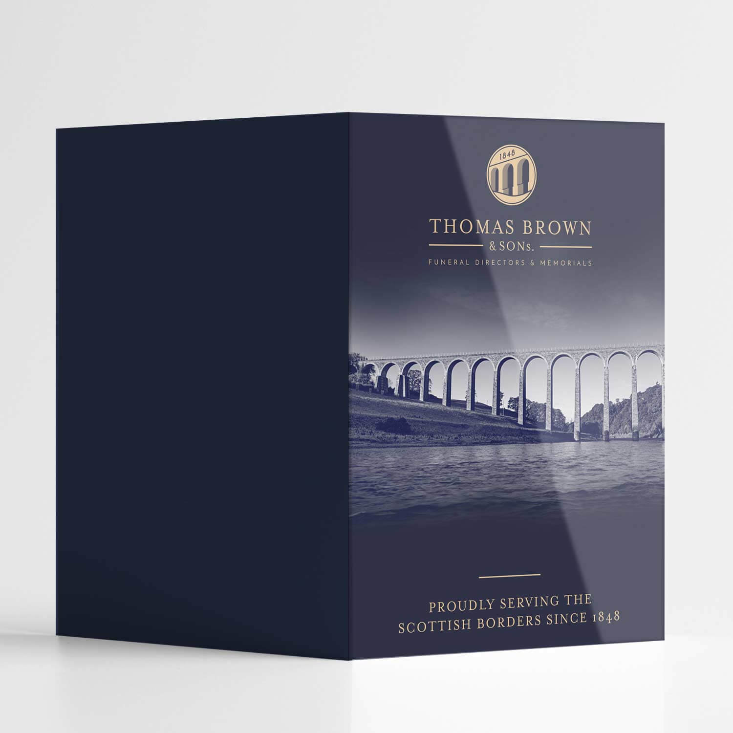
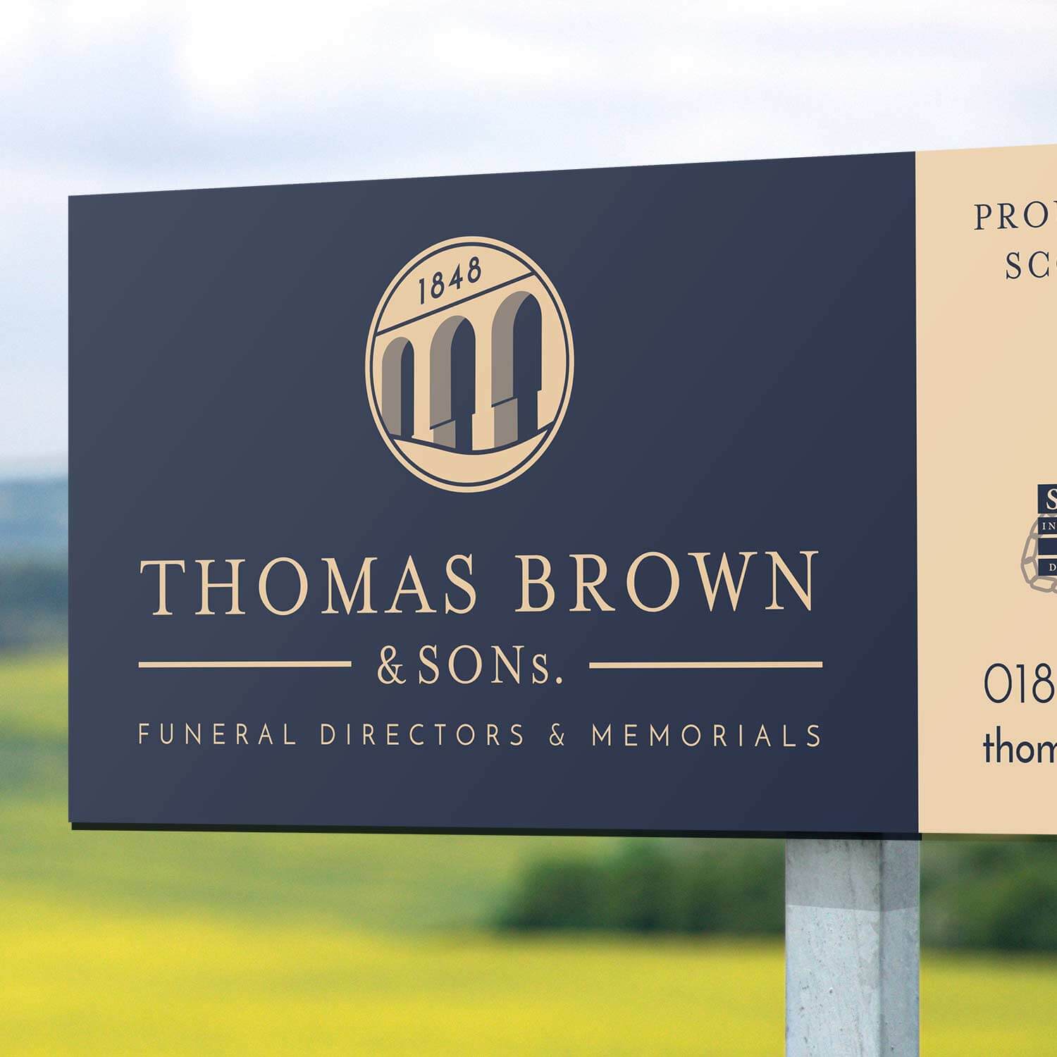
Thomas Brown & Sons are a family run business with deep historical roots connecting them to Melrose. Husband and wife team – Jacqui and Robbie Brown – approached us looking for a brand identity and a responsive website that both represented their family history and modernised their online presence. On discovering the Brown family had been involved in the construction of the iconic Leaderfoot Viaduct, we thought this was a perfect symbol to represent their brand and created a stylised motif as their logo.
responsive website
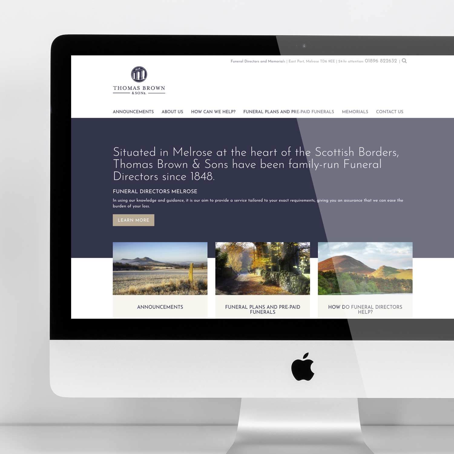
Using their new brand identity as a starting point, we designed a modern, informative, user-friendly website that guides clients through a difficult time by making it super easy to find any information they need. We created an announcements page, where funeral details can be posted and shared on social media, making it easier for the bereaved to organise such a difficult event. Visit the site here: Thomas Brown & Sons website.

design for print
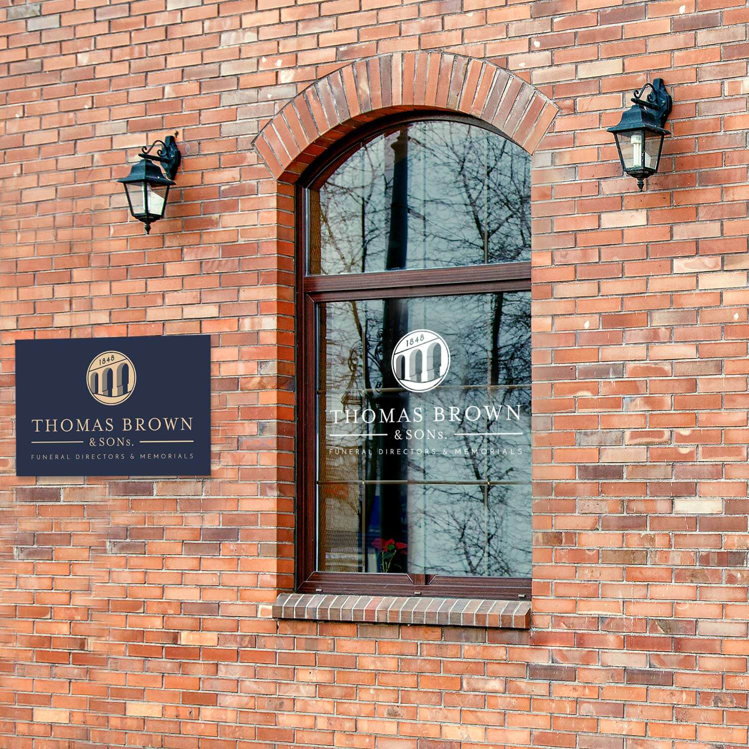
To further strengthen their brand identity we designed a variety of print materials, including a suite of corporate stationery and signage for their funeral home. We used the image of the Leaderfoot Viaduct throughout their printed materials and paired this with a muted colour palette to set the visual tone of their brand.



take the next step
Let’s discuss YOUR project and see which bundle suits you best.

