Shortridge Laundry has been on the go since 1845.
In that time, it’s been through the mill (s’cuse the pun)!
As it grew, so things changed. The shift away from the heritage feel meant the brand identity had developed to look more like a washing-up powder. Not exactly the premium look high-end venues, such as Stobo Castle, buy into.
Their MD Peter felt frustrated. Despite their great reputation, prospective customers were going elsewhere, due to perception.
With more competition than ever, a pandemic and an increasing headcount, he needed help.
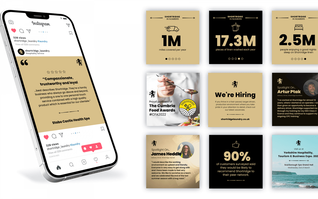
The challenge was to shift the perception back to that of a premium service partner to the hospitality industry.
Shortridge employs over 100 people, with deep community roots. We researched the industry, spoke to team and customers, to find out how they felt about Shortridge.
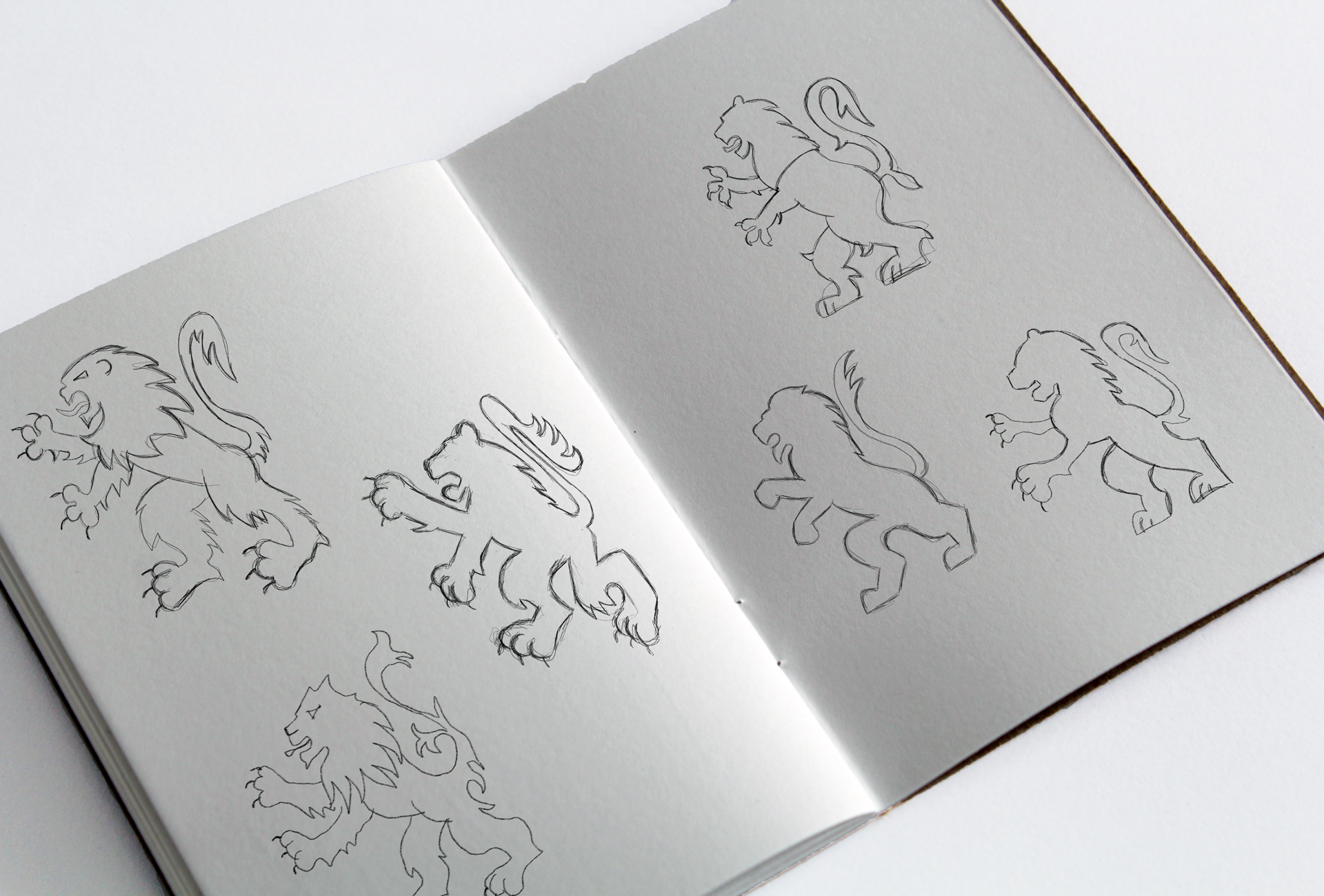
Visually, we revitalised their old lion emblem so it now combines gravitas and modernity. The ongoing marketing keeps them front of mind while the new website is fresh and informative.
The company invests in people and innovation, and while Shortridge is a business seeped in history, Peter and the team have a firm focus on the future.
Check out the full client story here.
And find out more about Shortridge here!